Stanton Europa: On Identity, Memory and Belonging
Through bold geometric compositions, expressive portraits and photographs of Cape Town, Stanton Europa explores cultural heritage, community and the changing language of contemporary African art.




Through bold geometric compositions, expressive portraits and photographs of Cape Town, Stanton Europa explores cultural heritage, community and the changing language of contemporary African art.
Through bold geometric compositions, expressive portraits and photographs of Cape Town, the South African visual artist explores cultural heritage, community and the changing language of contemporary African art.
For Stanton Europa, art begins with the familiar: the streets of Cape Town, the colours of African cultural traditions, the architectural character of a city and the everyday experiences that shape people’s identities.
Raised on the Cape Flats, the multidisciplinary artist, photographer and graphic designer has developed a visual practice that draws on his surroundings while embracing contemporary digital techniques. His work moves between photography, portraiture and abstraction, with recurring interests in heritage, representation, belonging and the relationship between people and place.
Europa’s creative journey began with modest resources, using a mobile phone and freely available editing tools to experiment with photography and design. Through independent learning and sustained practice, he expanded into graphic design, digital illustration and visual storytelling. Today, his portfolio reflects an artist interested in how colour, shape and composition can communicate experiences that extend beyond the image itself.
The city as memory: Civitas CT and Civitas CT II
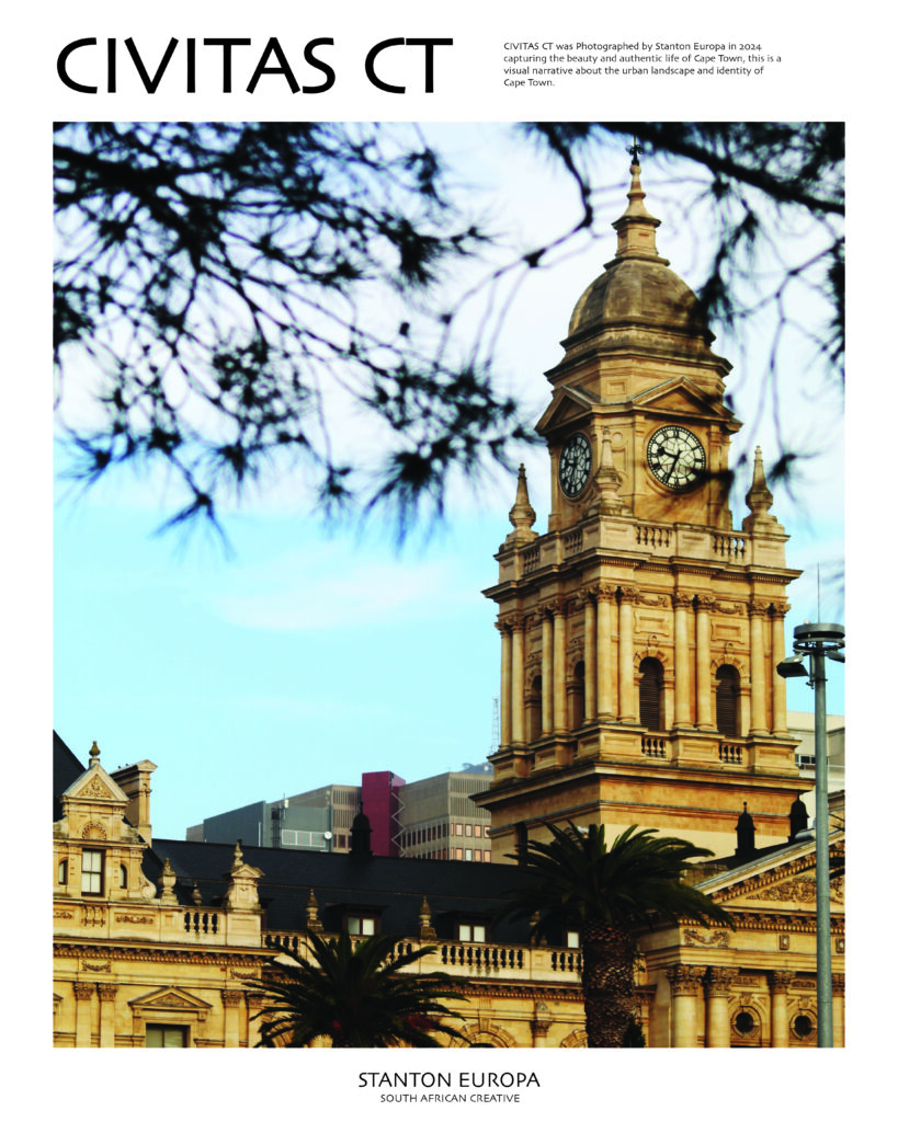
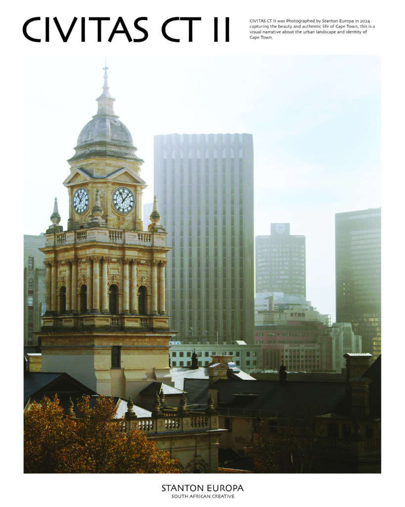
In Civitas CT and Civitas CT II (2024), Europa turns his camera towards Cape Town’s historic City Hall, capturing the imposing clock tower against contrasting urban backdrops. The first photograph frames the sandstone architecture through dark, overhanging branches, with palm trees and a luminous sky lending warmth to the scene. The second places the same tower alongside modern office buildings, creating a visual conversation between the city’s architectural past and its evolving skyline. Through these two photographs, Europa demonstrates attention to composition and his interest in the character of familiar places. The clock tower becomes an enduring marker of Cape Town’s history, standing amid the physical changes that continue to reshape the city.
Cultural identity: Ndebele
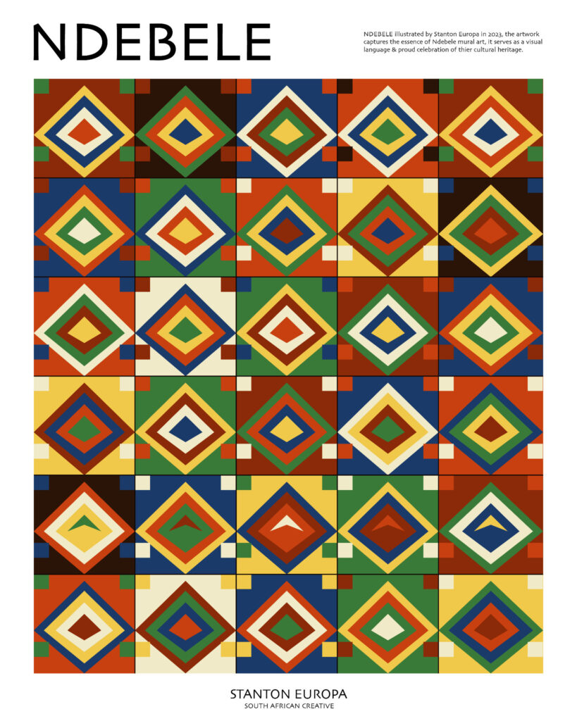
Ndebele (2023) celebrates the visual traditions associated with Ndebele mural painting through a grid of vividly coloured geometric patterns. Diamonds arranged in concentric layers repeat across the composition, combining yellow, green, blue, orange, white and deep brown in changing sequences. The regularity of the arrangement creates rhythm, while variations in colour give each section a distinctive identity. Europa draws on an established African decorative tradition and translates its geometric vocabulary into a contemporary digital composition. The work reflects the continuing relevance of cultural design practices and their capacity to inspire new artistic expressions.
Strength of an African woman: Matriarch
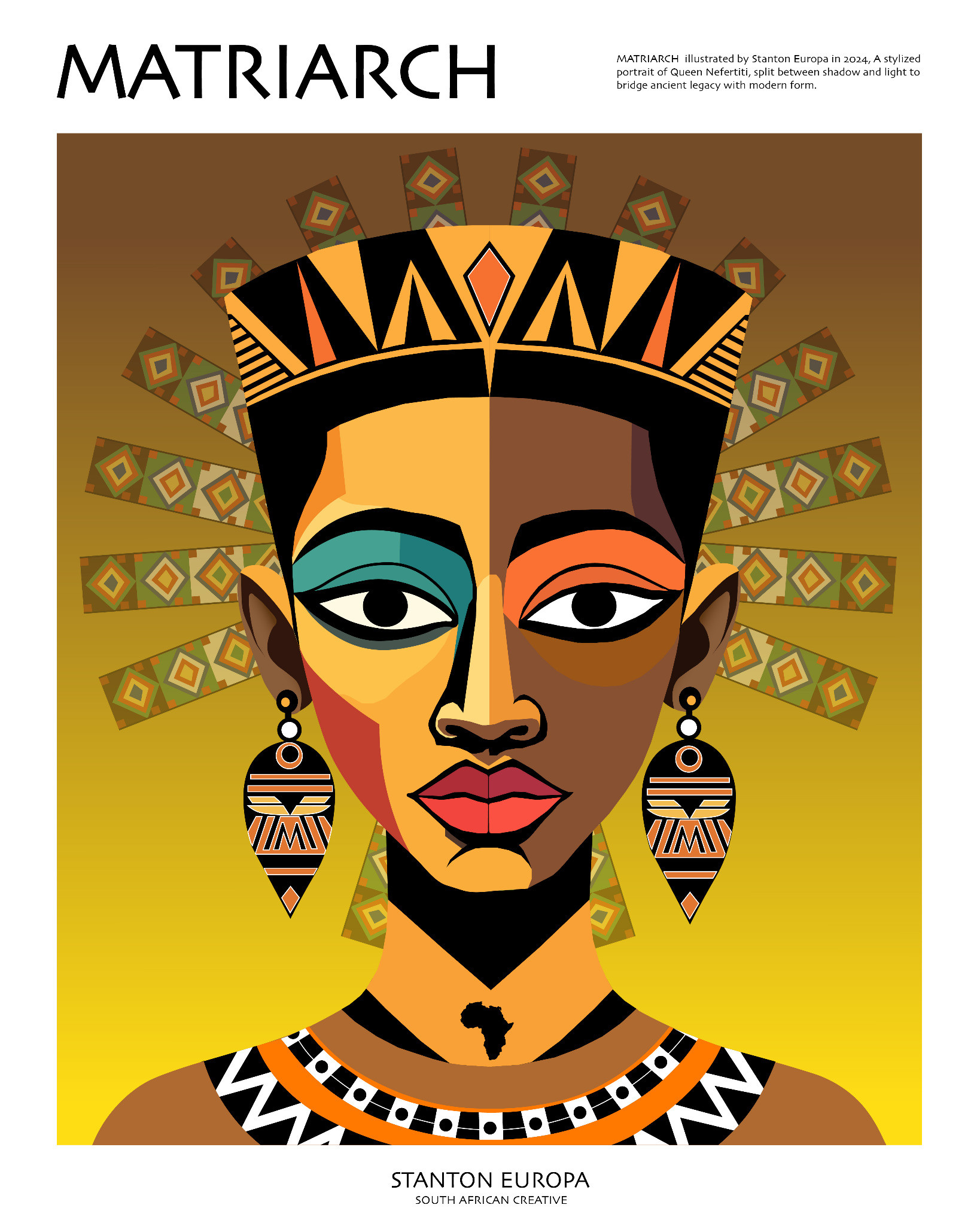
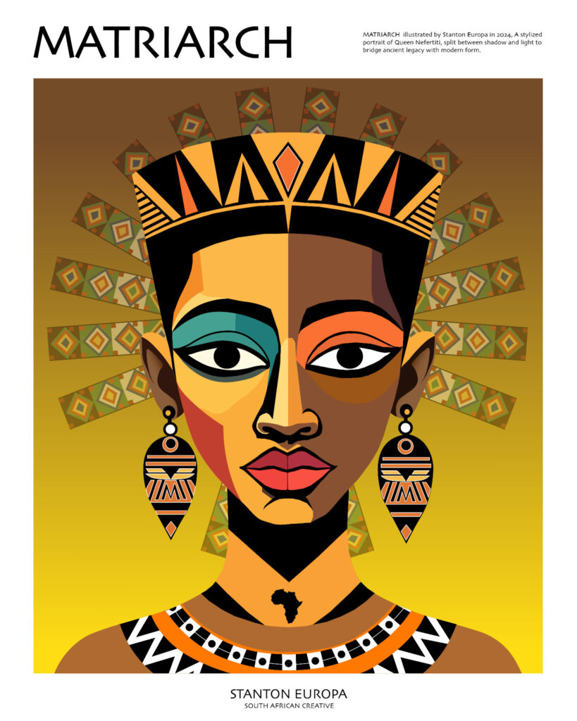
Matriarch (2024) is a striking stylised portrait of Queen Nefertiti, drawing on ancient Egyptian imagery to explore feminine authority and cultural inheritance. The figure faces the viewer directly, her elaborate crown and jewellery rendered in angular patterns of gold, orange, green and black. A radiant yellow background heightens the portrait’s commanding presence, while the symmetrical composition creates a sense of composure and permanence. The face combines contrasting tones and geometric planes, giving the historic subject a contemporary graphic identity. Through this visual treatment, the African woman is celebrated as an enduring symbol of dignity, cultural memory and strength.
A portrait of belonging: Kioo
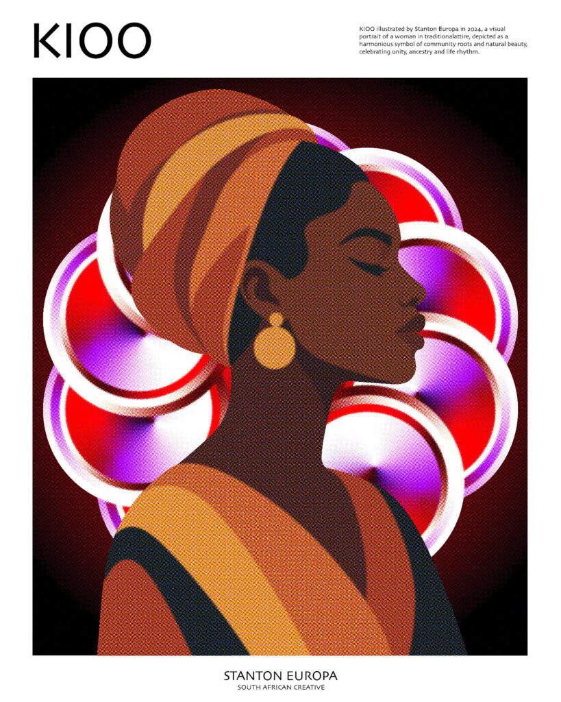
Kioo (2024) presents a woman in profile, wearing an elaborate orange headwrap against a background of interlocking circular forms. Rich orange tones dominate the figure, interrupted by deep shadows and vivid pink, red and white accents. The woman’s poised expression and traditional attire suggest confidence and cultural rootedness, while the circular shapes introduce movement and energy. There is an interesting tension between the stillness of the portrait and the rhythm of its background. Europa uses this contrast to create an image that speaks to individuality within a wider cultural community, celebrating the beauty of African identity through a distinctly contemporary visual language.
The face as a cultural canvas: African Eyes
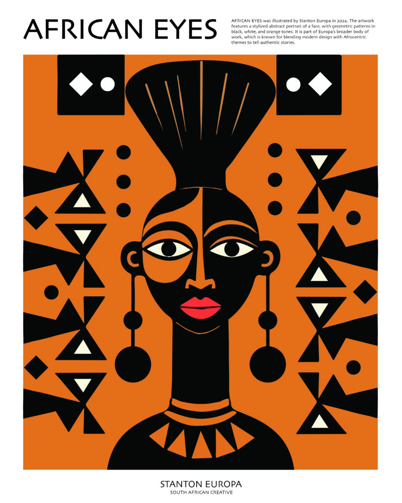
With African Eyes (2024) represents a female portrait to bold shapes, intense colour contrasts and carefully arranged symbols. It is set against a brilliant orange background with the woman’s face constructed through black and orange sections, with striking white eyes that immediately command attention. Repeated triangles, circles and diamond motifs surround the figure, creating a strong sense of visual rhythm. The composition draws attention to the expressive possibilities of geometry, showing how relatively simple forms can produce a recognisable and emotionally engaging portrait. Its direct gaze gives the image an assertive quality, suggesting a woman whose presence and identity are firmly established.
I Am Because We Are: We Ubuntu
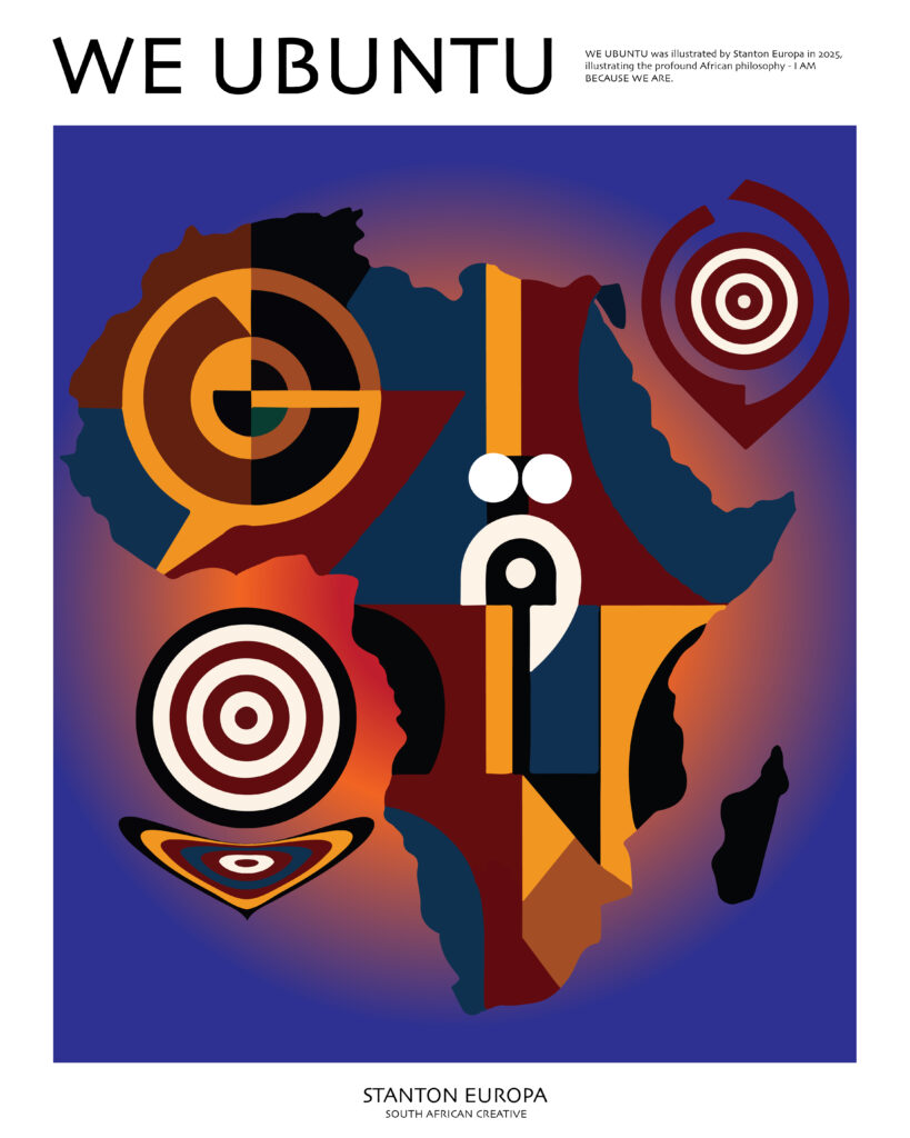
We Ubuntu (2025) is inspired by the African philosophy of Ubuntu – “I am because we are” – the belief that our humanity is shaped by our relationships with others. Europa places the outline of the African continent at the centre of the composition and fills it with overlapping geometric forms, circular symbols and contrasting blocks of colour. The deep blue background provides a unifying visual field, allowing the warmer orange, red and cream elements to stand out. Although the individual forms differ in shape and colour, they remain connected within a single continental silhouette. This visual arrangement offers an interpretation of collective identity, suggesting that Africa’s cultural diversity forms part of a shared human experience.
Finding stillness: Serene
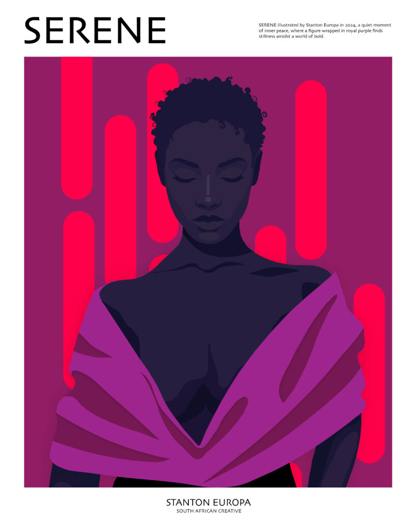
Serene (2024) showcases a quieter emotional register. A woman with closed eyes occupies the centre of the composition, wrapped in flowing purple fabric against a background of magenta and deep violet. Her expression conveys calm and introspection, while the vertical pink forms behind her provide visual structure. The restrained palette, subtle facial details and balanced composition encourage the viewer to linger on the subject’s peaceful expression. The image suggests a moment of personal reflection, communicating the value of stillness through the relationship between colour, posture and mood.
Geometry and visual rhythm: Harmony No. 2
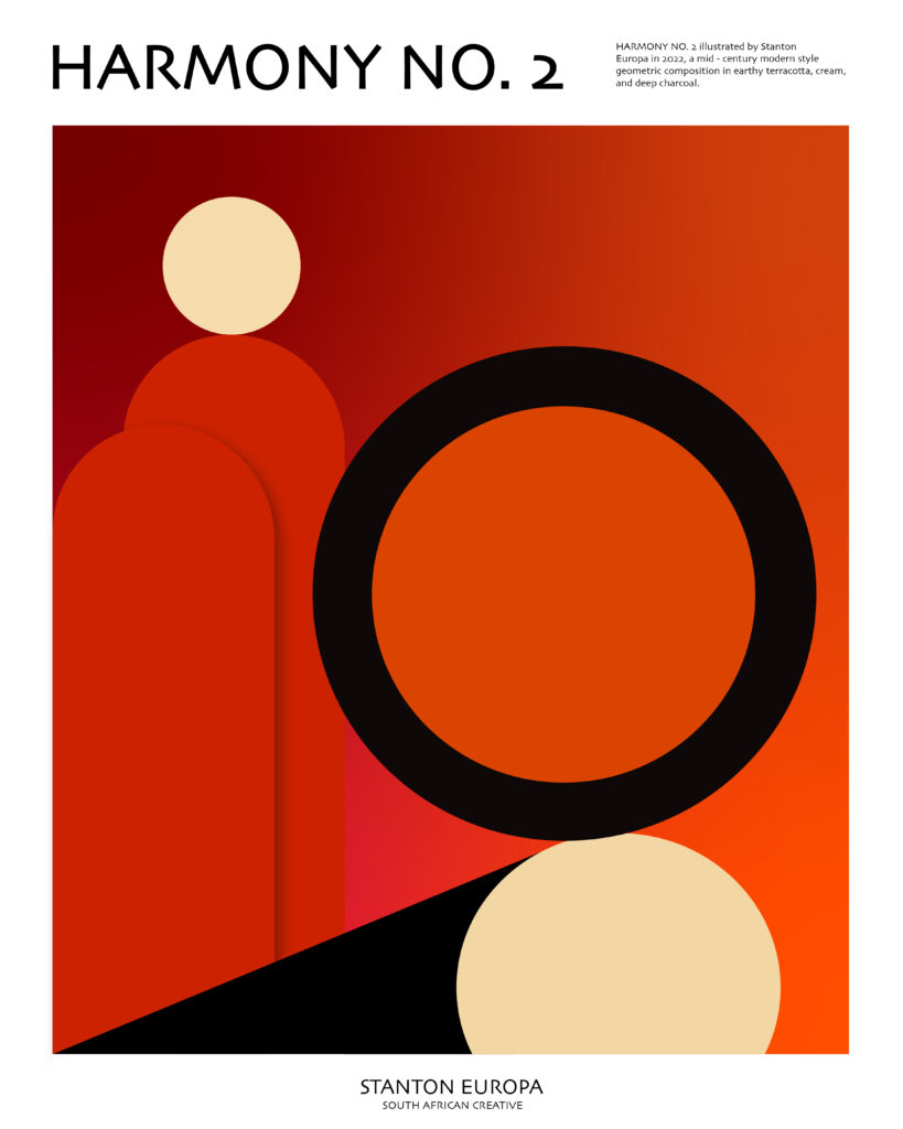
Harmony No. 2 (2022) demonstrates Europa’s interest in the expressive potential of elementary geometric forms. A large black ring dominates the composition, surrounded by rounded vertical shapes, cream circles and a sloping black plane. The palette moves between deep terracotta, red-orange and warm cream, producing a composition that feels both energetic and balanced. The arrangement of circles and arches creates visual movement, with the forms appearing to interact through their contrasting scales and positions. The work invites viewers to appreciate abstraction through the relationships between shape, colour and space, revealing how a limited vocabulary of forms can generate a compelling visual experience.
Nature through abstraction: Four Seasons
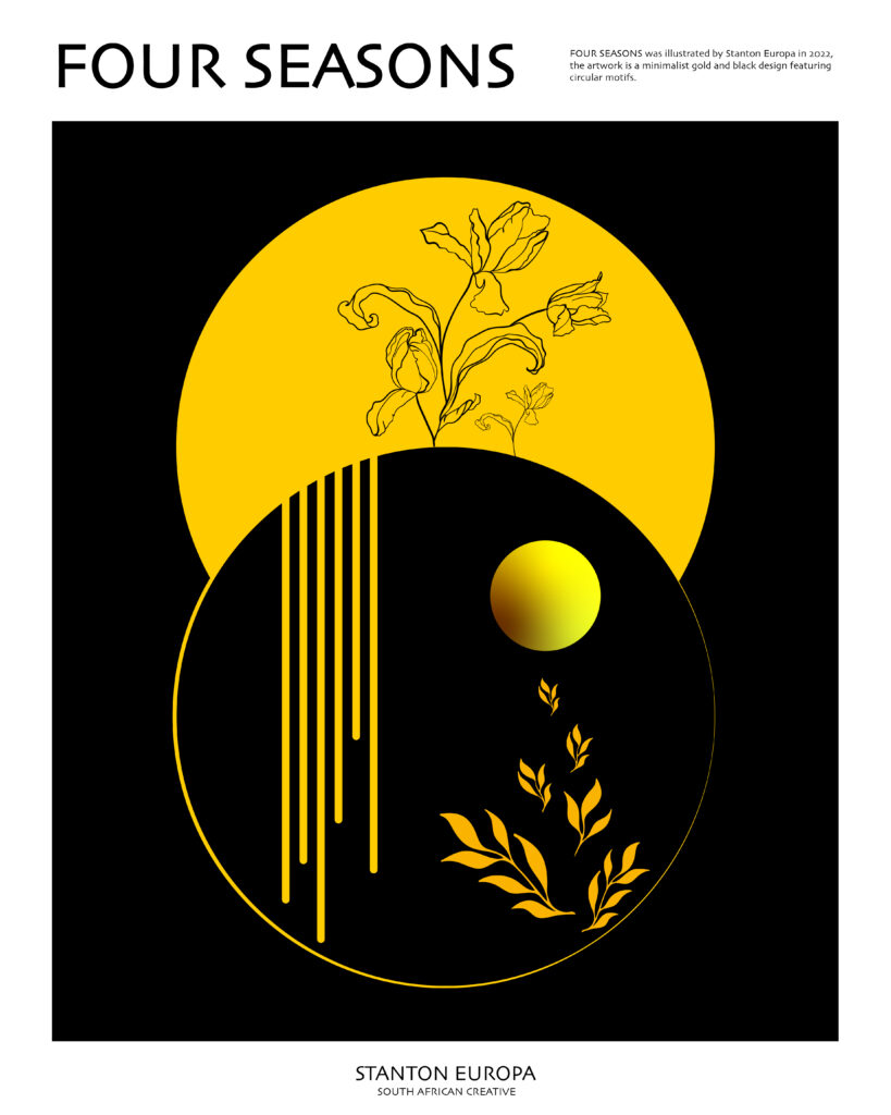
In Four Seasons (2022), Europa explores natural cycles through a minimalist composition dominated by black and gold. Two large overlapping circular forms contain delicate botanical illustrations, slender vertical lines and smaller organic motifs. The upper section features flowers emerging against a golden background, while the lower section combines darker space with leaves and a glowing circular element. These contrasting areas evoke different stages of growth, rest and renewal. Rather than depicting seasonal changes literally, Europa uses a symbolic visual language to communicate the recurring rhythms of nature.
Motion and abstraction: Vuka No. I and Vuka No. II
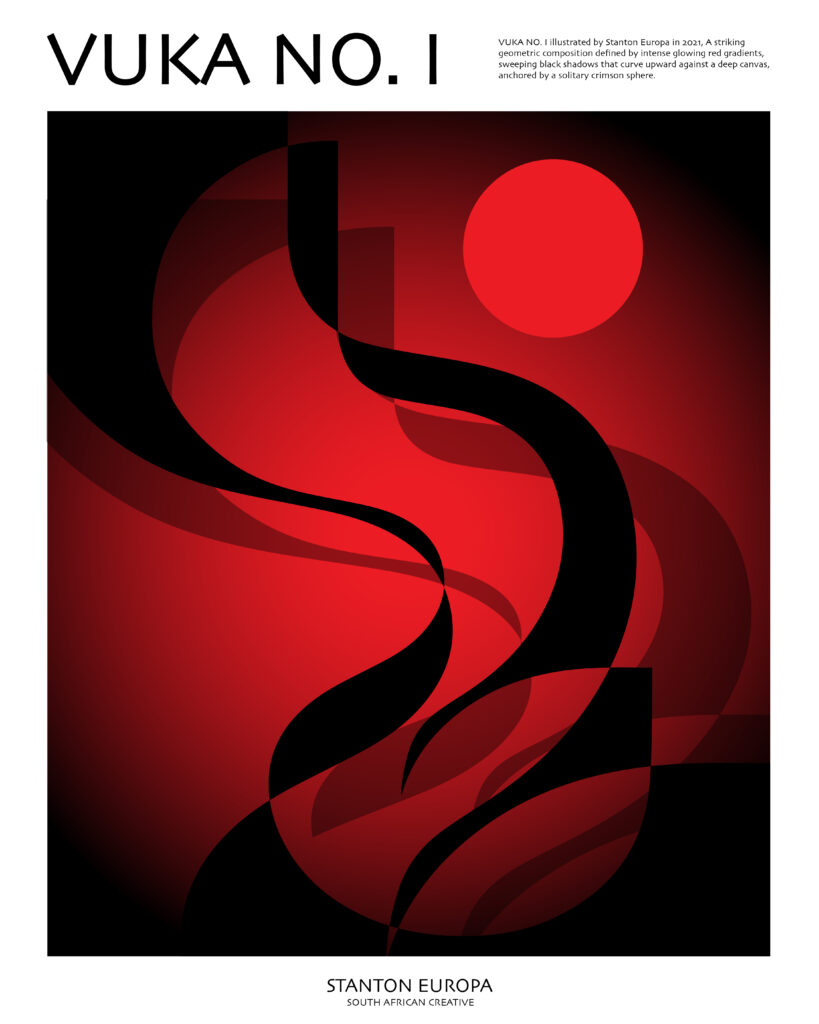
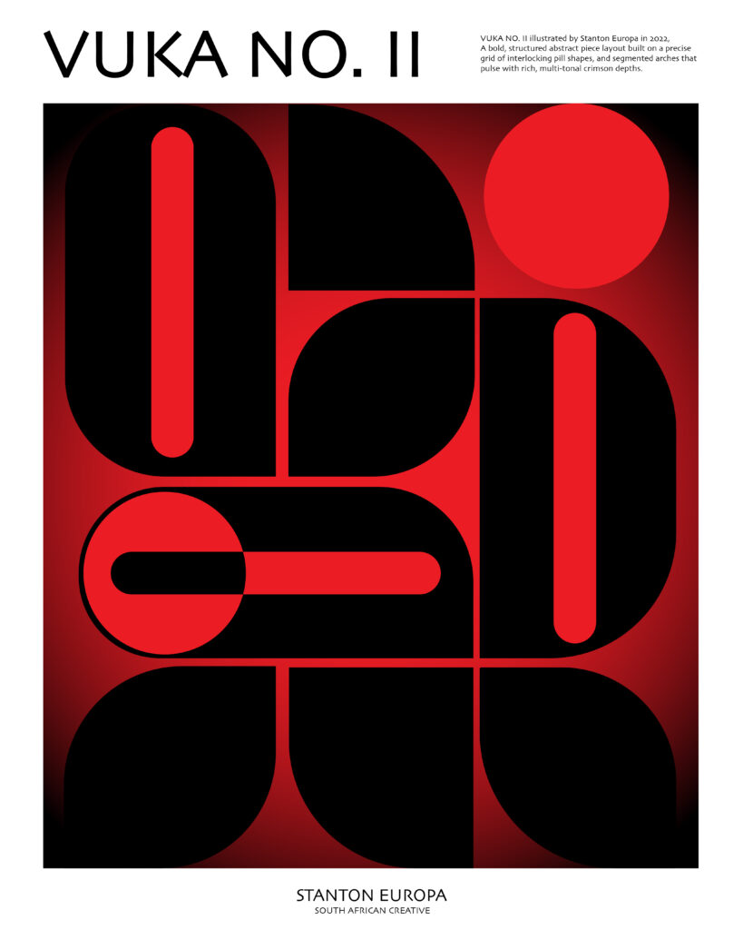
The Vuka series are two contrasting approaches to abstraction. In Vuka No. I (2021), sweeping black curves move across a field of intense reds, creating a sense of fluidity, tension and momentum. A solitary red circle provides a visual anchor within the shifting composition. Vuka No. II (2022), by comparison, adopts a more structured arrangement of rounded geometric forms, vertical and horizontal bars, and circular elements. The same red-and-black palette gives the two works a shared identity, yet their treatment of shape produces different visual experiences. Together, they reveal Europa’s exploration of movement, balance and the expressive possibilities of digital geometry.
Across these selected works, Stanton Europa demonstrates considerable stylistic range. His Cape Town photographs preserve the character of familiar urban landmarks, his portraits explore African identity and cultural inheritance, and his abstract compositions investigate the emotional qualities of colour and form.
A consistent interest in storytelling connects the different approaches. Compositions such as Matriarch, African Eyes and We Ubuntu engage with questions of cultural identity and collective belonging. Serene offers a more personal meditation on inner peace, while Harmony No. 2, Four Seasons and the Vuka series demonstrate his willingness to explore ideas through abstraction.
The relationship between creativity and lived experience is integral to these artistic pieces, and their creation is a reflection of the possibilities available to a generation of African artists using digital technologies to interpret their histories, environments and identities through contemporary forms. The result is a growing body of work that brings together cultural memory, personal expression and formal experimentation, contributing to the many ways African artists are representing themselves and their communities today.